I’ve been thinking, and talking online, and I’ve concluded that it’s not quite right that low production values are better for my enjoyment. Rather, what I want on my table, and in my prep environment, is artefacts that have a particular aesthetic and that (partly because of that) give me certain intuitions. There will always be an irreducible element here of “subjectively what I like, but cannot describe”, but I can put some of it into words.
So, in terms of direct things-we-can-agree-we-are-looking-at, what I am looking for in third-party artefacts I put on my game table is this:
- First, the presentation needs to be unobtrusive. It needs to be somewhat subdued. Put on my table, in my dining room, with the artefacts I’ve made myself, it shouldn’t stand out very much.
- This pushes design towards plain white paper, with monochrome or muted inks and a matte finish
- I think there is space here for some colour, for some striking art. It just has to be subordinate to the whitespace of the page. E.g. I’ve not seen Wet Grandpa in full, but the sample pages online suggests it fits in this category.
- This applies to covers as much as to internal pages, not least because small books tend to end up lying closed. I particularly enjoy matte covers on books, and would like some rpg books with cloth binding.
- The art can’t be cartoony, because that’s not something I can imagine an rpg world to be like. Cartoony art thus interferes with my internal image-making. Photorealistic art can work, as can more abstract forms. But the art of Dungeon World, D&D 5e, even Fate, doesn’t work for me.
- Explicit recognition that groups will hack and modify, without pretending that this is novel or that a book can give (or take) authority to do this.
- Shout-outs go to Knave for its “Rationale” sidebars, to the 5e DMG for its “three things to be really careful with when you’re hacking” (p263, para “Beware of…”), and of course Apocalypse World for its “how to hack this” appendix.
And as for the feelings and intuitions I get from them, I am looking for these:
- This artefact is of comparable value to the home-made artefacts that are on the table with it. It’s not better or more important than them. (Even if it is better, and indeed that’s why I brought it to said table, I don’t want that to be obvious. I want it to snuggle in with the rest and to work its magic subtly.)
- I could, with time and effort, I could have created this artefact myself, while remaining a hobbyist and an amateur, without needing a significant budget or to do rpg design all day.
- There can be an element of cunning here — Scrap Princess’s art in Deep Carbon Observatory looks like something I could sketch myself, but it isn’t. (see an example page in my previous post)
- The creator would see me as a peer — if we met, they would respect my (rather amateur) design skills, and find me worth talking to in that regard.
- The artefact was created for mature adults, not primarily for children, or for (arrested) adolescents. My social identity is that of an adult, if a rather odd one, and I want the artefacts in my games to support that. The artefacts I bring to games are ambassadors for my social role, so they need to be consonant with it.
- On some level, its appearance admits that the game is going to be messy. RPG play is always messy, disorganised, slapdash, especially in the styles I like (where players have the freedom to go where they like and do what interests them). Scrappy bits of paper, or things that are cunningly disguised as such, are honest about this. Glossy coffee-table books are not.
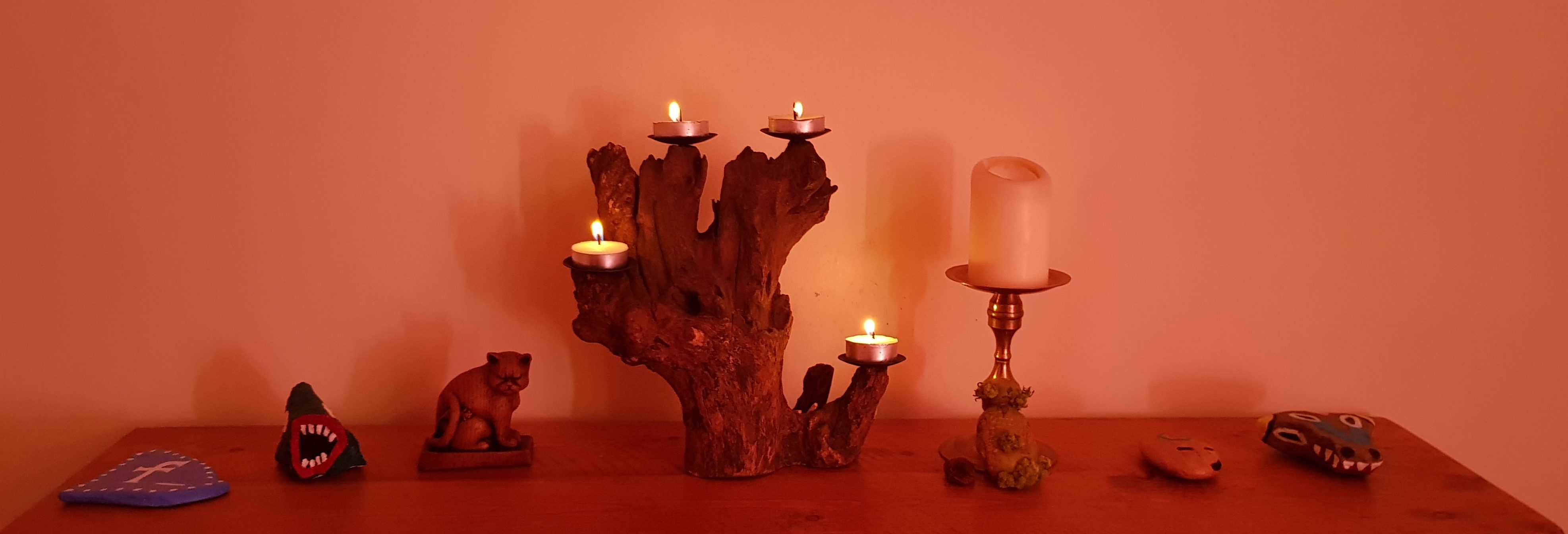
Interlude — when I say “my table” I literally mean my actual dining room table in my house where I live. I am literally talking about putting books on it, as shown below:

The above criteria are compatible with, but do not require:
- Skilled and elegant typography, because that can be subtle, and because I have some confidence in my typographic abilities and (crucially) in my ability and willingness to learn more.
- Good organisation for play. You can look like Deep Carbon Observatory while being quite a lot easier to run.
- Admittedly, part of that change would be a more precise, less sketch-like mapping style, which would challenge my comparable-value-to feelings. /u/realScrubTurkey suggested Winter’s Daughter as an example of good organisation, and based on the sample pages online it’s both well-organised and compatible with my aesthetic desires.
The above is mostly not compatible with:
- Art that is reliably inoffensive to a very broad audience
- Art that is consistently suitable for children
- Art that is gratuitously offensive to a wide range of people
- I am increasing reluctant to bring Lamentations of the Flame Princess books to the table. There are exceptions, but so many of them (including the core “Rules & Magic” book) contain art that is too offensive to too many people.
- Art that is elaborate, extravagant, or in any sense “lavish”
- Any textured backdrop that makes the paper look like anything other than paper, and exactly the type of paper that it really is
It’s clear that the preferences above are not widespread. But I suspect a good crowd of us share them. If you’re one of those people, I’d be interested in hearing from you.

I totally feel this!
I wrote a blogpost about RPG art a while ago and I think it might have gone in the same direction.
I think I don’t mind cool cover art
https://alexschroeder.ch/wiki/2019-05-15_The_purpose_of_art_in_a_RPG_product
Definitely feeling what you are laying down here. I’ll definitely refer back to this to inform my own OSR “middle way” style guide.